
Thinking of checking the website on mobile?

If you're making changes to your website, be sure to check how it looks on mobile. Here's how to easily check the mobile version in Squarespace.
It's likely that many of your customers view your website on a mobile screen. That's why we recommend that you check that the mobile version looks good before settling on a new article or subpage on the website.
Luckily, you don't need to get your phone out to check this. Squarespace makes it easy by letting you see how your site looks on mobile and tablet right in the tool.
How to check the mobile view from a PC:

Edit mode on the website that you are accessing. At the very top of the window you will see a gray line (marked with a red arrow). Click on the line.
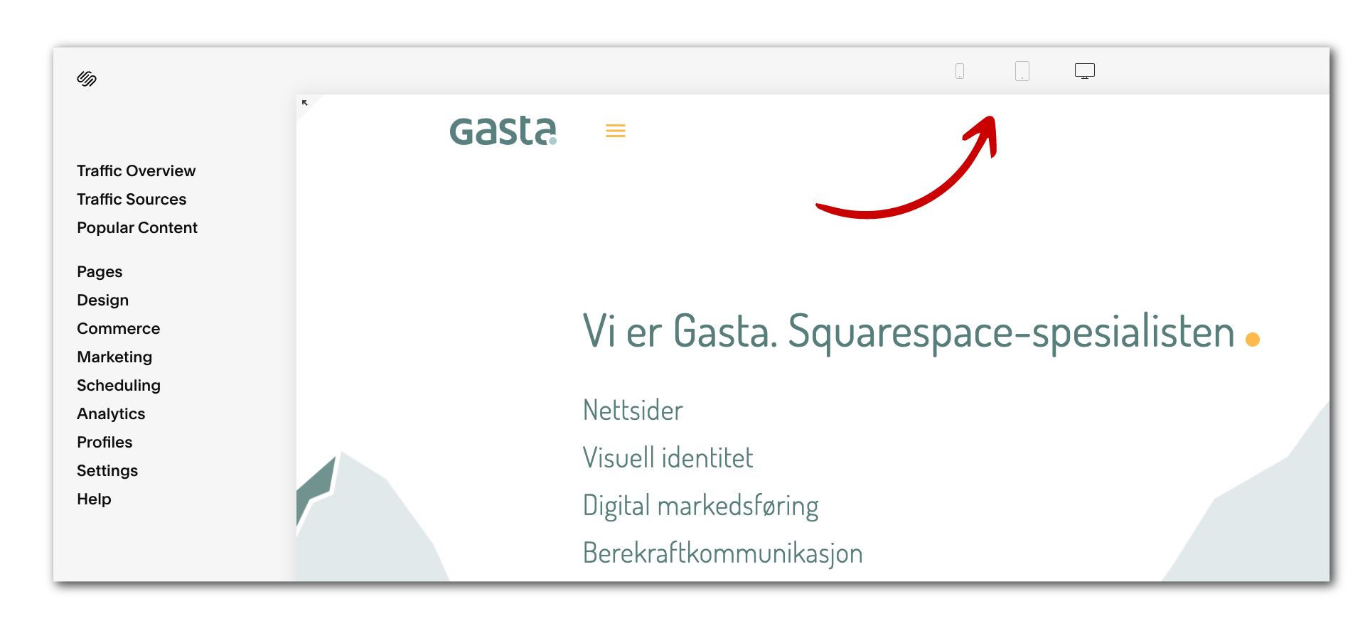
You will see icons for mobile, tablet and PC. Click on one of them and you will see that the view of the website changes.

Here we have clicked on the mobile icon and can now see the mobile version of the website. You can switch back to desktop view at any time by clicking on the PC icon.


