
This area of the website is crucial
When we develop new websites, we often start with a simple question: What should be at the top of the homepage?
The top section - also called the banner area or hero section - should be simple to create. A headline, a short explanation, and a button. Yet many projects stop right here.
The reason is simple: The top section reveals whether the brand is actually clear.
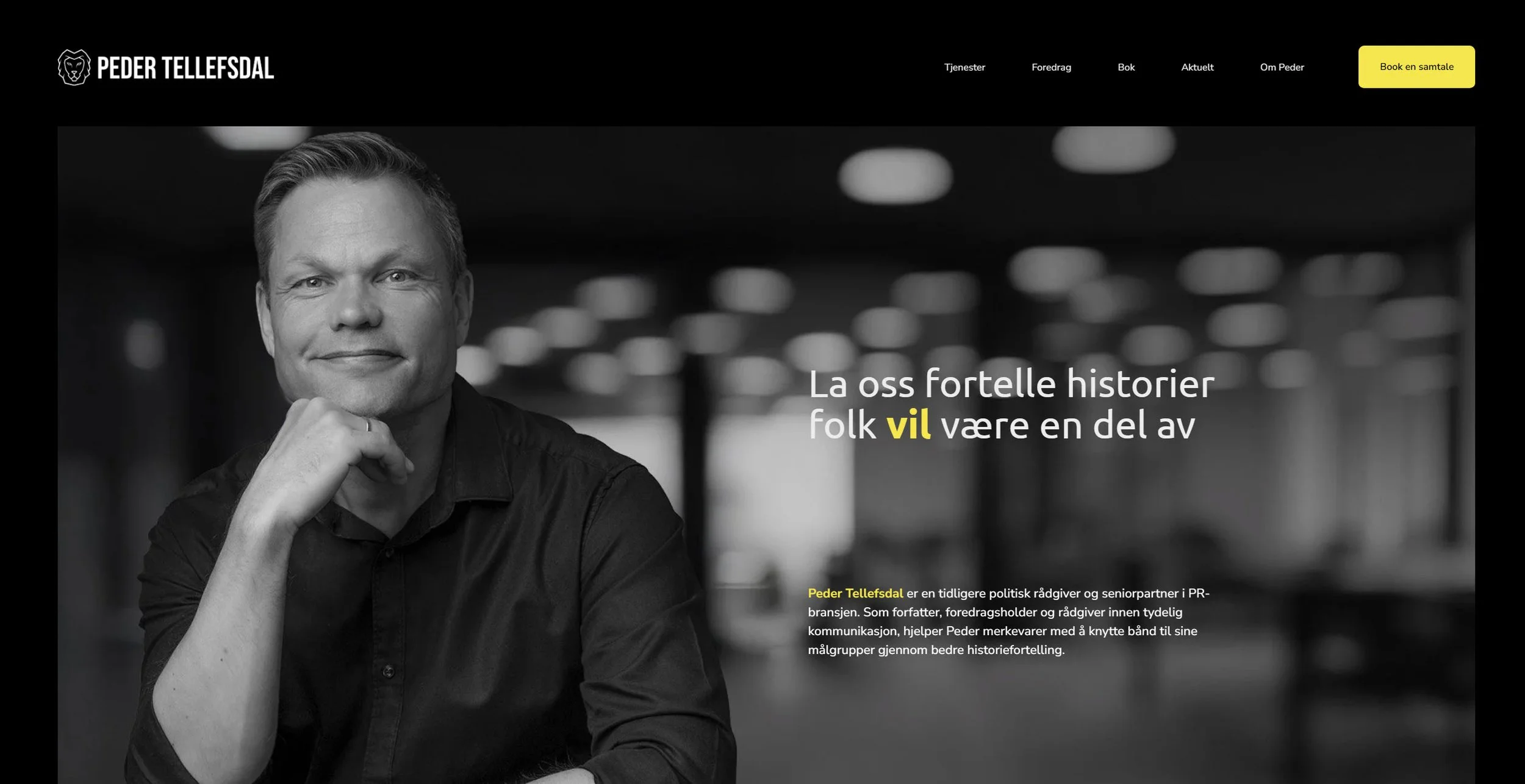
The top section of Peder Tellefsdal . The headline focuses on what needs the service covers. The subheadline tells how Peder Tellefsdal covers them.
Why is the top section so important?
The top section is the first thing visitors see when a website loads. That’s why a lot of the work of a website needs to happen right here. Research into user behavior shows how important this area is. 57% of all viewing time on a website happens above the fold.** At the same time, people form a first impression of a website in a fraction of a second.
If the top section is unclear, visitors may disappear before they even start reading.
The most concentrated version of the branded product
The top section is the most visible place on your website. In just a few seconds, a new visitor must understand what you offer, who it is for, and why it is relevant.
Therefore, the top section is actually the most concentrated version of your brand.
Or put simply: The top section is distilled brand strategy. When the message is clear, the rest of the website becomes easier to understand. When the message is unclear, nice photos or animations are of little help.
When the top section gets difficult
Many people think the challenge lies in the text or design. In practice, it is often about strategy. The company may be trying to speak to everyone. The brand promise is unclearly formulated. It is unclear what need you are going to meet and how you are going to meet it. Or it is not defined in which category the business actually competes.
When these things are not clear, the top section also becomes unclear.
A simple test
Open the front page of your website and only look at what is visible before scrolling.
Can a new visitor understand what you offer in three seconds?
If the answer is no, the problem is rarely in the design. It is in the message.
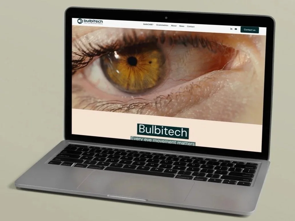
Bulbitech: The brand promise is centrally placed. Then you can be creative, like here in the use of video. Check it out!
When the top section works
The top section is not decoration. It is the place where strategy, brand and communication meet. When you are clear about what needs you are meeting, who you are talking to and why customers should choose your company, the top section also becomes simple.
And when the top section works, something else often happens too: The entire website becomes clearer.
Then the top section does its job! It gives the user a quick understanding of what the company is about – and why it's worth staying.
Read also: Gasta and rebranding
Contact us for more information.
**Source: Composite Global